Logo Design | 2013
Link: https://www.ictcoffee.com
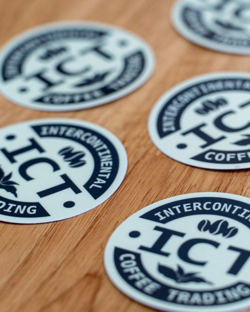
Back in 2013, I was contacted by a former coffee shop manager I’d worked with in the early 2000s. He was now in the green coffee trade and needed a fresh, trustworthy logo for the company he worked for, Intercontinental Coffee Trading.
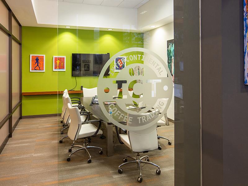
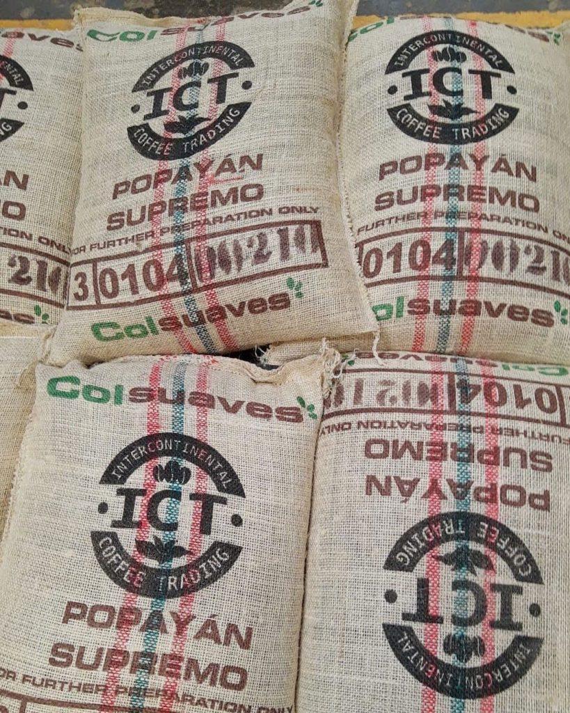
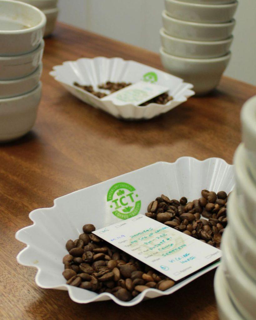
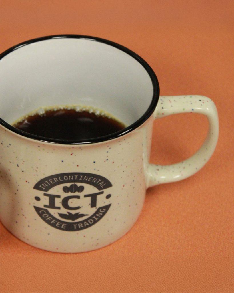
The brief was clear: something simple, timeless, and versatile — a mark that could work on bags, invoices, signage, or a burlap sack in a warehouse. So I leaned into classic circular logo structure (which naturally implies a stamp or seal of approval) and combined it with earthy greens, soft cream tones, and a balance of icons: a coffee bean up top, and a leafy plant below.
The clean, bold type gives it an industrial strength — like it’s been around for decades — while the subtle details keep it grounded in the world of agriculture and trade. It’s still in use today, which says something about its staying power.