Full Brand & Design System | 2015
In the summer of 2015, I got a message from Dave — the same guy who originally brought me on for Intercontinental Coffee Trading. He had launched a new green coffee business in San Diego with a few colleagues and asked if I could help with the full creative direction. We’re talking branding, website, email templates, collateral, merch — the whole works.
I designed and built the website, laid out type and color guidelines, and created email templates for both customer-facing and internal comms. I also handled print materials: business cards, order sheets, flyers, postcards, shirts, and even seasonal event promos. The brand extended into the physical space too. The office used a warm wood motif, and the identity carried through everything from signage to a custom cold brew tap handle.
It was one of those rare projects where the design got to touch everything — and actually helped shape how the business felt in real life.
Logo

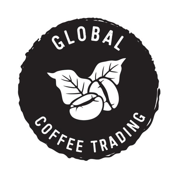
The Global Coffee Trading logo was designed to be bold, rustic, and easy to work with across all kinds of brand materials. Built around a circular layout, the mark features stylized coffee beans and leaves at its center, a direct visual link to the company’s focus on green coffee sourcing.
The distressed border echoes the edge of a bottle cap, a subtle personal nod to the founder’s love of craft beer. Paired with clean, condensed type and a weathered finish, the result feels stamped and grounded — like it belongs on a burlap sack, a business card, or the side of a shipping crate.
It’s a single-color design built for flexibility, made to print cleanly on everything from flyers to shirts to cold brew tap handles. The goal was to strike a balance between approachable and established, and visually root the brand in both craft and trade.
