Brand & Packaging Design | 2017
In 2017, I was contacted by Mike Correll — filmmaker behind Chet Zar: I Like to Paint Monsters — about a new project: a card-based oracle game called Mysterian. His vision was a little bit mystic, a little bit surreal, and rooted in the same kind of dark, thoughtful energy found in the work of artists like Chet.
Mike needed a logo and brand system that could live across cards, packaging, and merch — something flexible, but still distinct and moody. I designed a mark that feels like it was unearthed from an old book of symbols: bold enough for a box cover, mysterious enough to stand alone on a shirt or pin.
The result blends occult energy with modern clarity — a clean but enigmatic design that feels like it’s been waiting to be discovered.
It helped support a successful Kickstarter campaign and gave Mysterian a visual identity that holds its own among indie tarot and gaming titles.
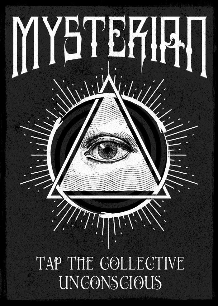
Logo
The design centers around a single, watchful eye — a classic symbol of perception and insight — framed by a triangle and a radiating circle of energy. But the deeper layer lies in the details: three intertwined snakes subtly emerge from the geometric forms, looping through the design in a nearly hidden pattern.
The triple-serpent motif adds a rich layer of symbolism: transformation, knowledge, and the sacred power of threes. They’re not immediately obvious — and that’s intentional. This is a logo meant to be read into, not just looked at.
The design blends distortion, layering, and intentional imperfections to create something that feels ritualistic, screen-printed, and timeless — like it was discovered rather than made.
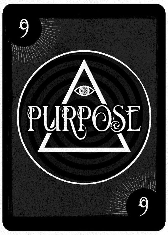
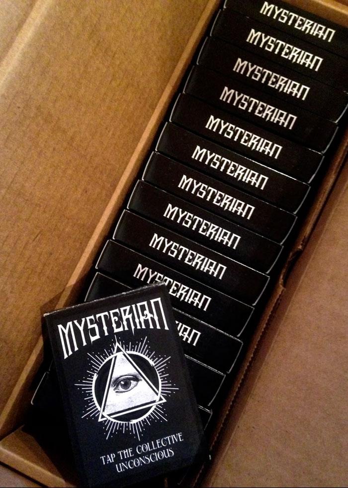
Cards & Box
Apparel
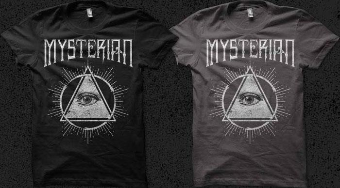
The Mysterian shirts were designed with screen printing in mind: bold lines, a single-color layout, and just enough grit to give it that worn, cult-classic feel. The high-contrast illustration — centered around the all-seeing eye and wrapped in three hidden snakes — holds strong on both black and charcoal tees.
The logo’s circular composition creates a natural focal point, while the stylized Mysterian text balances the design with a heavy top frame. It’s the kind of shirt that reads from across the room, but still rewards a closer look. Clean enough for production. Strange enough to stand out.